A full rebranding initiative for the Town of Nederland—building a bold visual identity and refreshed messaging to match its reputation as one of Colorado’s most iconic, independent mountain towns.

The Pickle

With support from a state grant, Nederland saw an opportunity to update its identity—but wanted to do it on its own terms. Growth and outside interest were already shaping perceptions, and the town needed a way to tell its story clearly, proudly, and without losing control of the narrative.

Through deep, empathic research—including direct input from over 15% of the town—this rebrand surfaced and addressed tensions rather than glancing over them. The result wasn’t consensus, but clarity: an identity system honest enough to hold contradiction.

89% of them fail.

It’s not for lack of talent or effort—it’s that places are layered, emotional, and full of competing perspectives. A good destination brand has to speak to visitors and locals at once, create connection without cliché, and still leave room for disagreement. That’s not something you can A/B test your way into.

It’s also not as easy as pure democracy. I ♥ NY barely cleared 51% support when it was first introduced. Great place branding requires clarity, not consensus.

On a basic level—yes. The brand was approved, it’s in use, and a lot of people in town love it.

But it was a rocky trip. Our approach to consensual, ground-up decision making worked beautifully for the 15% we engaged directly. What it didn’t account for was the broader audience on Facebook—folks who hadn’t been part of the process but still wanted to blow it all up, many of whom weren’t even residents.

Still, the end work held after countless revisions. And over time, even the naysayers have come to see what it represents: a town that knows who it is, warts and all. It may not be formal proof of efficacy, but they’re buying their own local ski resort rather than letting outsiders move in. That counts.

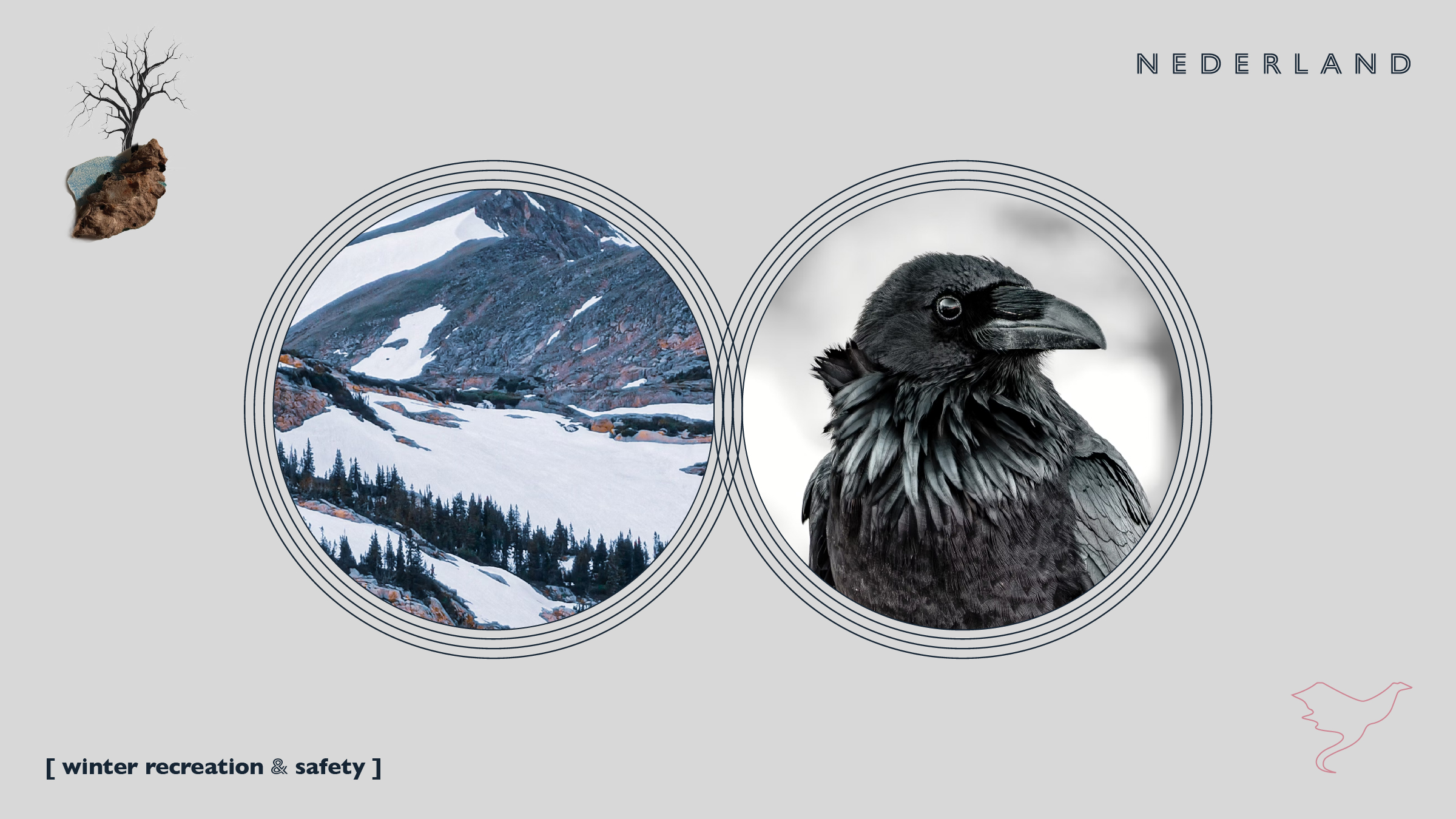
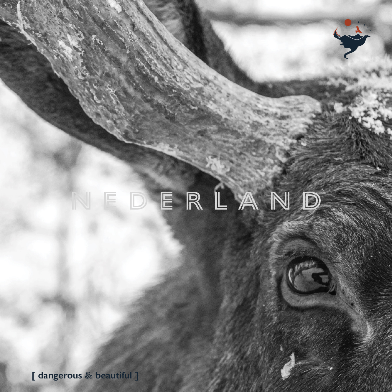
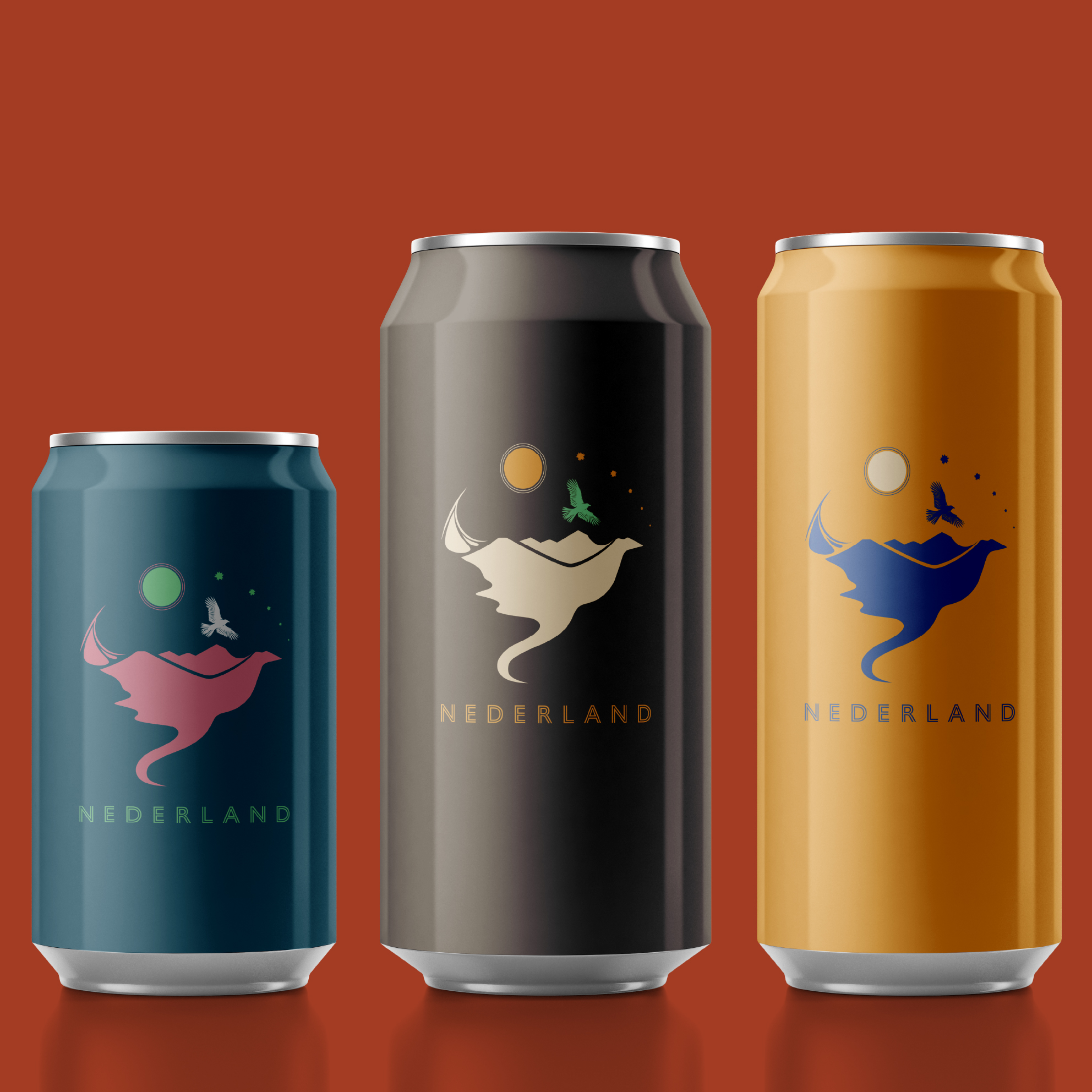
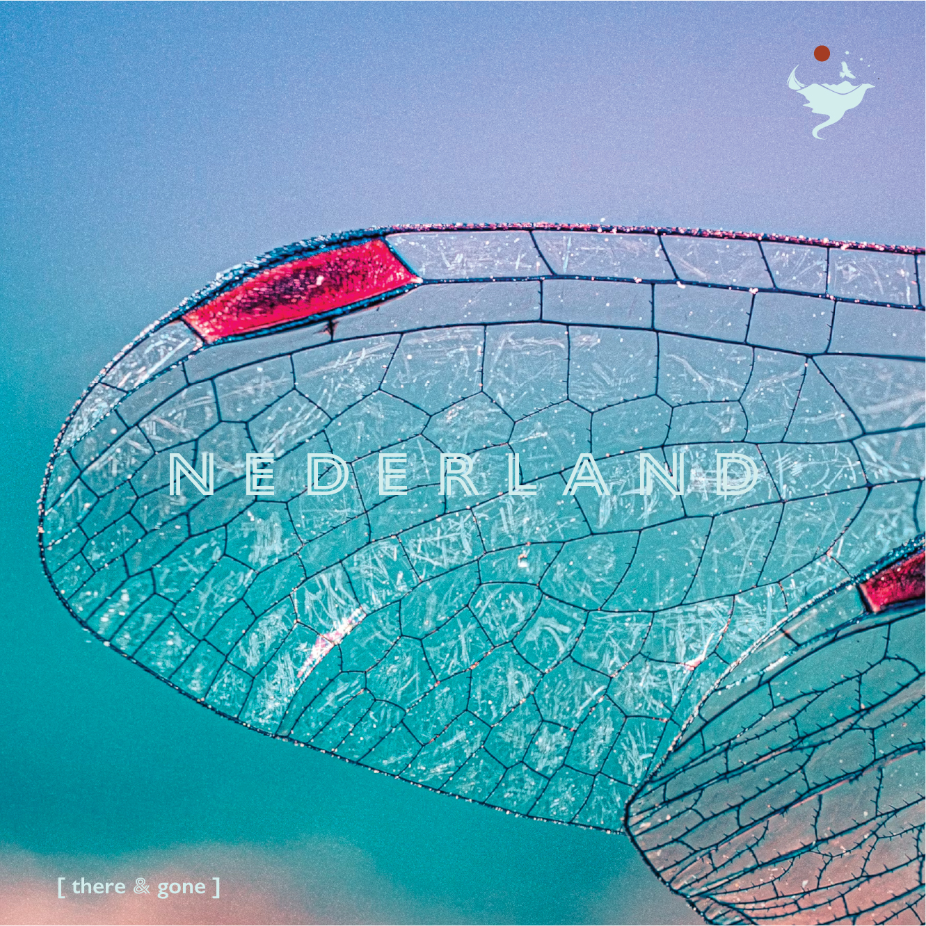
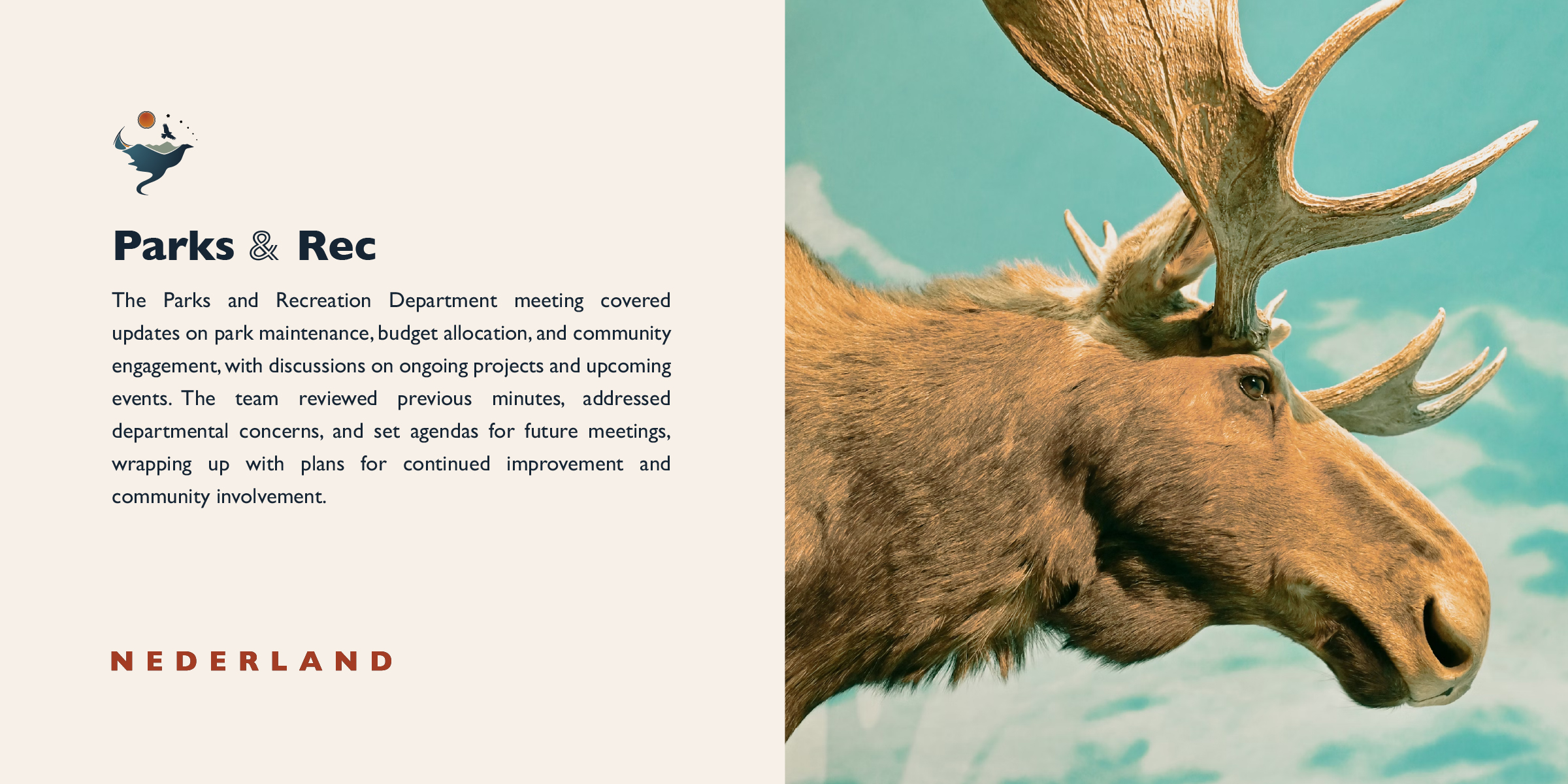
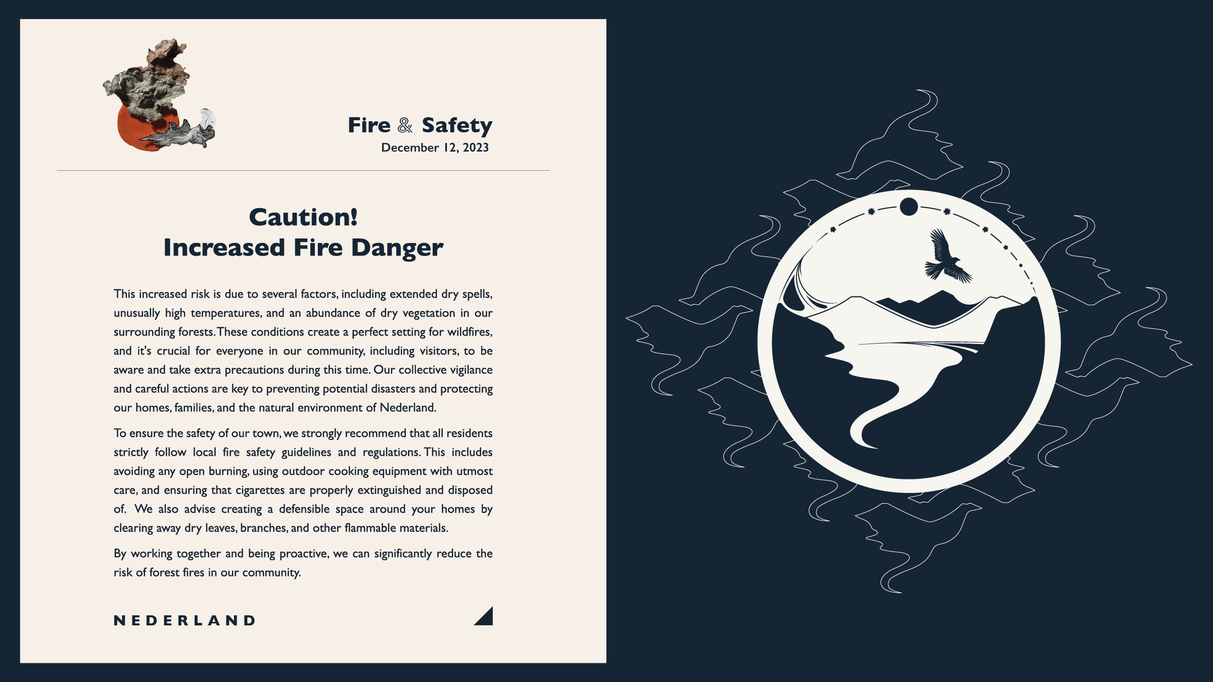
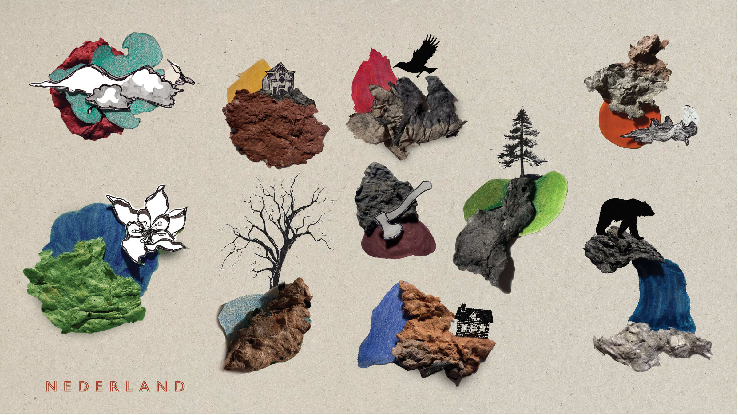
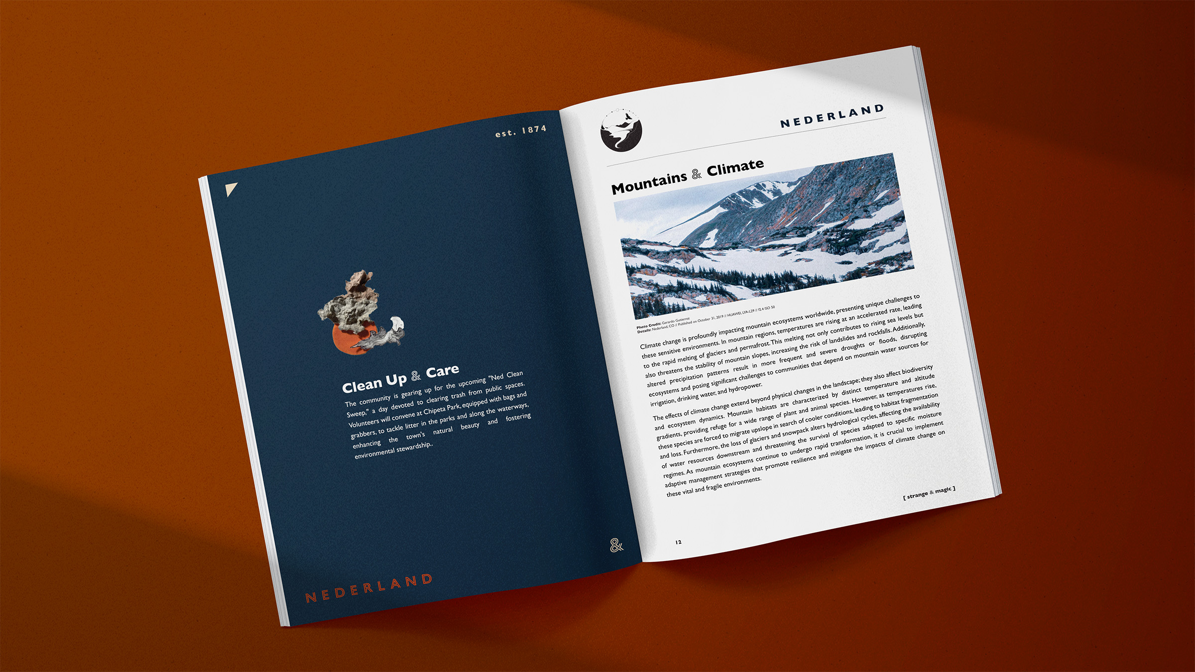
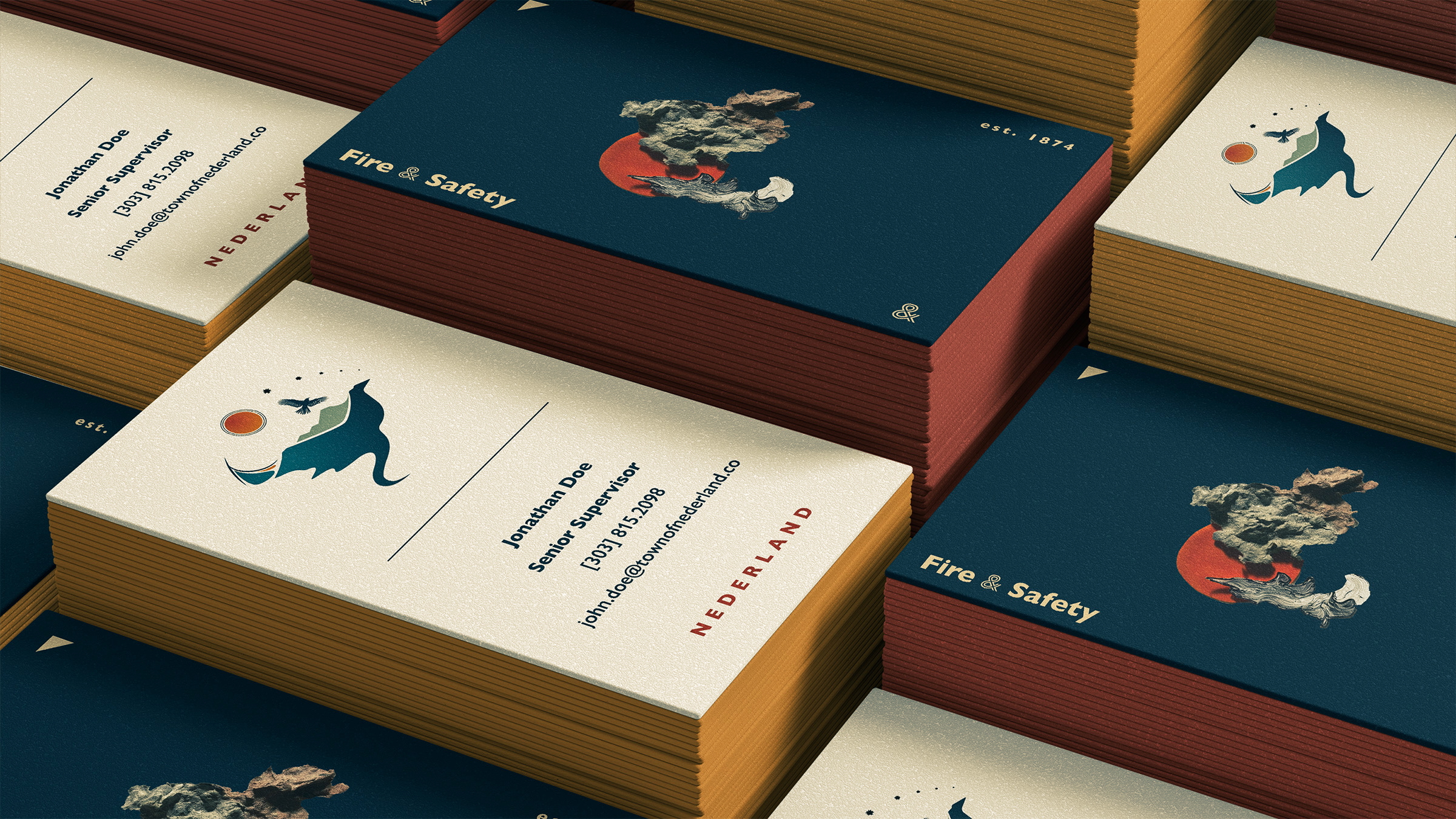
These are Boops. We <3 them.

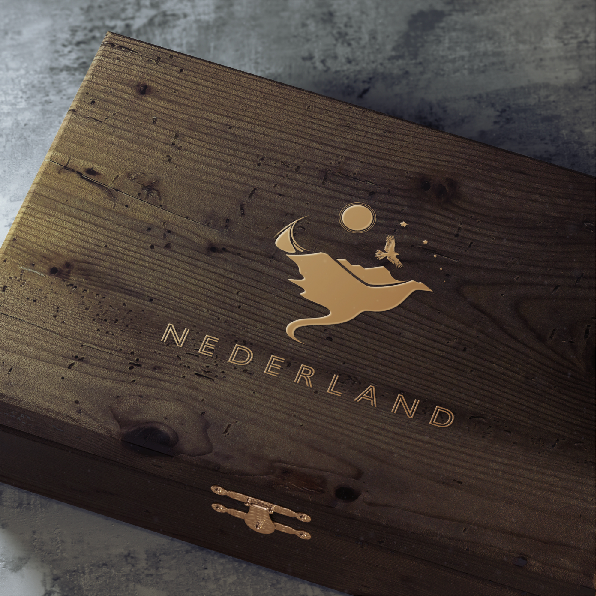
Made from recycled paper mache and colored using pigments from local soil, these handmade elements provide a bespoke, aggressively post-digital design element to the visual identity. They are an organic mark to high-level categories that the town uses, such as parks & rec, summer concerts, or weather advisories.

Thanks to Dr. Miranda Fisher, Peter Cacek, and Trustee Sterling along with the members of the community creative cohort, with deep gratitude to local resident and volunteer firefighter Laurelyn for sharing her art that helped inspire pieces of the logo.

Full brand book here.